Jessica Marie Ingold

A concept UX/UI design festival that combines the strong foundations of UX/UI with electric visuals.

Brief
Livewire UX Design Festival was a self-directed concept festival. The main requirements of this brief were to include a Convention Day, a Exhibition Day and a Workshops Day that would take place across 3 Days and to fully design a brand for the Festival.
Due to my interest in User Experience Design, I decided to create a UX Festival that combined electric energy with the exchange of knowledge and experience of UX.
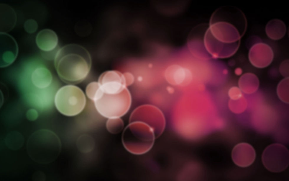
I was inspired by Neon Signs found in Music Festivals and Events. The electric vibes these items invoke fit perfectly with my vision for this Project. The bright colours used throughout this project further support the neon effect especially with a black background to the make them glow.
The main purpose for this concept Festival was to
-
Represent my skills using ADOBE Illustrator (particularity the Pathfinder Tool and Pen Tool)
-
Enhance skills in Branding
-
Enhance skills in ADOBE Photoshop (particularly using Mock-ups).
-
Enhance skills in ADOBE InDesign for layout.
Role
Project Manager, Designer.
Tools
Adobe Illustrator, Adobe Photoshop, Adobe InDesign.
Ideate
Once I was given this brief, I decided to conceptualise a festival that based around the UX and UI Design community in Australia which is an area that I am interested in. After researching existing festivals and events regarding UX/UI Design in Australia, I quickly realised there are few.
I designed the Livewire UX Design Festival to fill a space in the design convention arena. By combining electric visuals and vibes with the fundamentals of User Experience/User Interface Design, I wanted to create an event that fuses the sharing of knowledge and the celebration of the UX/UI Industry in Australia.
This project was created with the intention of it being held at the ICC in Sydney, and last for 3 days.
With the Convention kicking off the electric vibes, the 3 days of this festival include Exhibitions and Workshops that encourage the beneficial interaction between Professionals and Students alike.

Design Process
Colour Scheme
The bright, neon colours of Livewire Festival Brand colour scheme is used throughout all aspects of Merchandise, Promotional material, Official Correspondence and Social Media. Black is always the background colour at #000000.
Livewire Orange is the primary colour of the Convention day of the festival. Livewire Blue is the primary colour of the Exhibition day of the festival. Livewire Pink is the primary colour of the Workshops day of the festival.
#EB974A
#C04E85
#5195A1
Typography
For the Livewire UX Design Festival brand I chose two fonts from a Type Super Family named DIN Alternate Bold and DIN Condensed Bold.
I wanted the Typography of Livewire to be bold San Serifs so that the Neon effects will perform properly and the Icons will become the main focus.
DIN Alternate Bold
DIN Alternate Bold is used primarily for the Livewire Logo and its variations. To imitate a neon sign, the logo has no fill and uses only the stroke of the font. The logo has a neon effect made by the use of Gaussian Blur and an Outer Glow.
DIN Condensed Bold
DIN Condensed Bold is used for Titles and the body copy of all Merchandise, Promotional Material, Official Correspondence and Social Media. Most titles will have a neon effect while body copy will have no effect for ease of reading.

Logo Design
After choosing the font for the Logo, I experimented with the outline of DIN Alternate Bold. Using the stroke instead of the fill created a symbolic representation of 'Wire' within Livewire.
Neon Effect
Once I was happy with the layout of the logo and the outline of DIN Alternate Bold, I created a neon effect using the Appearance Tab of Adobe Illustrator.
Adding three stroke panels on the original logo outline, I created the neon effect by using different stroke weights, colours, and special effects (particularly the Gaussian Blur and Outer Glow options) to replicate a neon sign. I made a neon effect for the three Brand colours and made them Graphic Styles for easy transfer to other brand items.
Main Logo
The Main logo will be used for all official documentation and promotional material.

Alternate Vertical Logo
I then created an alternate vertical logo that will be used mainly for social media and merchandise. This version is differs slightly from the official logo for contrast. The Livewire name and the year the festival takes place is featured on this version.
Hashtag
The Livewire Hashtag is used primarily for social media and is the horizontal version of the Alternate Vertical Logo. The Livewire name and year of the festival is also featured in the Hashtag.


Icon Design
To create visual appeal, I designed three simple icons that represented the UX industry, such as a Flowchart and a Wireframe. To keep in line with the outlined logo design, each icon has stroke but no fill.
All icons were created in Adobe Illustrator using the Shape Tool and Line Tool.

Reflection
This project was not only great fun to conceptualise and design, but also a great lesson in areas such as poster and merchandise design, logo and icon design and how colour, typography and layout combined can create a brand and visual identity.
This project also increased my skills in Adobe Illustrator by using the Appearance panel to create various effects and style on text and shapes. It was particularly helpful to show how the Pathfinder Tools and Appearance panel in Illustrator can be utilised together to create lively graphics.
This project also increased my skills regarding to layout design since I had no prior experience designing promotional material such as posters. Creating a cohesion between all merchandise and promotional material further taught me how important a visual/brand identity is to a design.

